
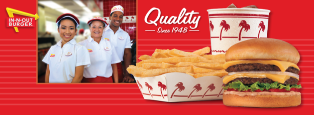
This ad was featured on In-n-Out’s Facebook page. It does a great job on using all 4 design principles and, even if you’re not a fast-food junkie, makes you take a second look.
Contrast

The use of the bright white in the employees’ uniforms, the drink cup, and the tray of fries contrast well with the bold red. The great difference in these colors is key as they make each stand out to the eye. It gives a spotlight to both the light hues and dark shades. The yellow in the fries and the cheeseburger also differ nicely with the red and white, in the background. The difference in the colors makes for a mesmerizing ad. It draws you in with its boldness of use in contrast.
Repetition

The red palm trees are used consistently in the design of the sponsored drink cup and tray of fries. The red palm trees are also found in the design of the actual In-N-Out establishment. This repeated logo gives the viewer an association of food to this food establishment each time a red palm tree in seen.
Alignment

The emphasis in this ad is the food and that’s where your eyes go first. Then your eyes are guided to the “quality since 1948” phrase in this ad, which aligns in the center right alongside the picture of the employees. After your eye is draw in with the food, the structure and position of the phrase comforts the eye and guides it to the picture of the employees, thus re-emphasizing their focus on great quality.
Proximity

The picture of the cheeseburger and fries immediately captivates the eye first. This is the ultimate fast-food combination and it is made to look absolutely scrumptious. Keeping the food and drink grouped together illustrates the focus of the ad, which is quality.
Color

The repetitive use of the color red is training the mind to associate In-N-Out food with the color red. Not only is the background red, but many elements associated with this establishment are also red. The employees’ uniforms and building decorations are red. Red is even in the food. Red is everywhere. White is also present. It is such a different color than red, but also has a strong presence. Although the white color may take up less space than the red color, it seems to stand out a bit more.
All of these design principles marry together this ad perfectly. The bright, clear images used are comforting to the eyes. Their placement and colorful uses are key to making this ad feel complete. You feel good viewing this ad.

Leave a comment