


Introduction
I used an article by President Thomas S. Monson published in the Liahona in 2012. Link:
https://www.lds.org/liahona/2012/12/rediscovering-the-christmas-spirit?lang=eng
My focus in the design of this spread was the true meaning of Christmas. Being as the article itself is about the Christmas spirit, I only thought it natural to enhance on this topic. So often during the Christmas holiday we get carried away with the materialistic nature of it that we tend to forget why we celebrate in the first place. The article touches on discovering the Christmas spirit anew so in my photos I wanted to depict a cozy feel to it and also reference our remembrance of Christ.
Photographic Elements
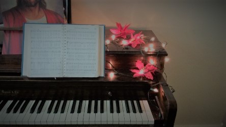
The first photo I used for the cover was of a piano with an open hymn book and Christmas decorations surrounding it. Just above the hymn book you can see a picture of Jesus cut off bit. The piano, with the decorative lights and open hymn book command a reverence to the photo of Jesus standing just above. This dynamic represents the praising of our Lord. The photo of Christ reminds us that we celebrate Him during the holiday season. He is our focus, but is often left off to the side like the photo represents. We draw near to him with our hymns, but are we really turning to fully see him? The second photo I used is of a traditional nativity set with wrapping paper laying on the floor in the background. The nativity set has lights around it to portray a holiness to the birth of Jesus. This is to represent the Christmas story which should be our focus, especially around Christmas time. The gift paper laying in the background is blurry and unfocused. It represents the worldly holiday traditions which are less important and distracting. These should fall to the background of our lives as we focus on the Savior’s birth.
Color Scheme
Tints and shades of red were used throughout the spread. This was due to the photo of the Christmas flowers decorating the piano. It is also a color seen a lot around Christmas time and people often reference this color to this holiday. I used a very dark red for the body and a lighter red for the title and pull quote. I also used a red bottom stripe to tie the pages together with the cover page’s red stripe. The background color of the pages I determined using a tint of red mixed with a neutral beige. I wanted something that blended in with the color of the wall near the piano. The reason for this was to make the piano stand out more. Then I carried over to the second page and third page, a different tint of the first page’s background color.
Typography
I used a Gabriola font for the title of my spread. I purposely made the Christ in Christmas a different font, Tahoma. The Tahoma font is a Sans Serif font, whereas the Gabriola is not, so I used that font to make Christ stand out in the word Christmas. Thus, giving the rest of the body text a strong start and the reader a clue as to the stance of the article. In the body text and headings I used the font, Tahoma, to contrast with the title. To make the headings stand out I made them in all capital letters and put them in bold. In the pull quote I used the Gabriola font to make it stand out among the body text of Tahoma.
Overall Design
My targeted audience is adults and all who feel they have lost the Christmas spirit each time it comes around. I tried to reach those that felt something was missing in the Christmas holiday and those who didn’t quite feel the spirit of Christmas. Adults get so caught up in the gift-giving and trying to make their children’s Christmas magical that they tend to forget the true meaning of it all. By using a photo of a display of the nativity scene I hoped to show that most of us have this type of setup around our house at Christmas time, but we don’t really stop to think about the story behind the miniature display. In order to feel the true spirit of Christmas we need to focus on Christ and his birth. In my nativity scene photo I included wrapping paper in the background, blurred. My intent here was to show a contrast between the less important festivities and the true meaning behind the Christmas celebration. In the piano photo I hoped to draw in the audience by setting a reverent tone in the dim lighting. The picture of Christ cut off a bit gives a clue that we focus on Christ at times, but tend to leave him in the background too. The open hymn book was to show what we do around Christmas time in singing Christmas songs.
Conclusion
Overall I hope to help my audience to come to a realization of where they stand with their Savior and how they can remember him. I want them to improve the quality of their Christmas celebration and really make it about Christ. I want them to feel an abundant Christmas spirit, especially around Christmas. With my design of dimmed lights to show reverence, and red shades to reminisce in Christmas, I hope to start everyone on the right track. In viewing my design I would like others to feel a warmth and joy for the holiday.


Leave a comment